Create Your First Project
Start adding your projects to your portfolio. Click on "Manage Projects" to get started
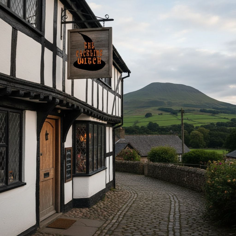
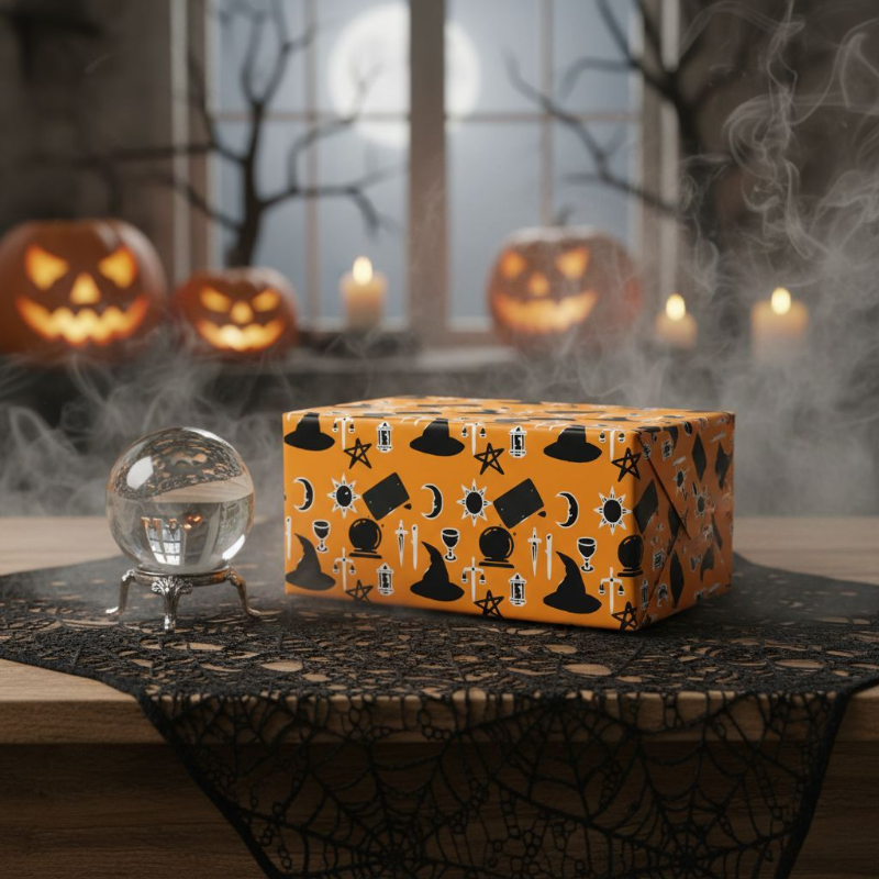
the cackling witch
Brand Designer
Brand Designer Artist
Branding
shop branding
Color Palette:
Primary Color: A warm autumn orange to evoke the season and align with the witchy theme.
Accent Colors: Dark purples or deep greens could complement the orange and enhance the mystical vibe.
Logo: Wordmark: Hand-drawn typography that captures the essence of witchcraft, incorporating whimsical element
A crystal ball integrated into the logo, representing tarot and medium readings, adding an enchanting touch.
Visual Consistency, the primary color and hand-drawn elements for backgrounds and borders.
Design templates for promotions, readings, and shop updates, allowing for easy customization while maintaining brand cohesion.
Website Graphics: Homepage: Feature a captivating banner that highlights the rebrand evokes the Pendle Witches’ story.
Product Images: Use consistent backgrounds and overlays that align with color palette and branding style.
Pattern Design: Motifs: repeating patterns using elements like crystal balls, tarot cards, and autumn leaves to be used on packaging, website backgrounds, or merchandise.
Hand-Drawn Aesthetic: Maintain the whimsical, hand-drawn feel throughout all designs.
This approach should help you create a cohesive, enchanting identity for your shop that honors the Pendle Witches while inviting customers into a magical experience!


